Playbook

I partnered closely with Playbook’s founding team during a six-month contract to establish the company’s early visual and interaction foundations. The work focused on defining a flexible design system that could support both product development and early brand expression as the product and company shaped their identity.
IMPACT
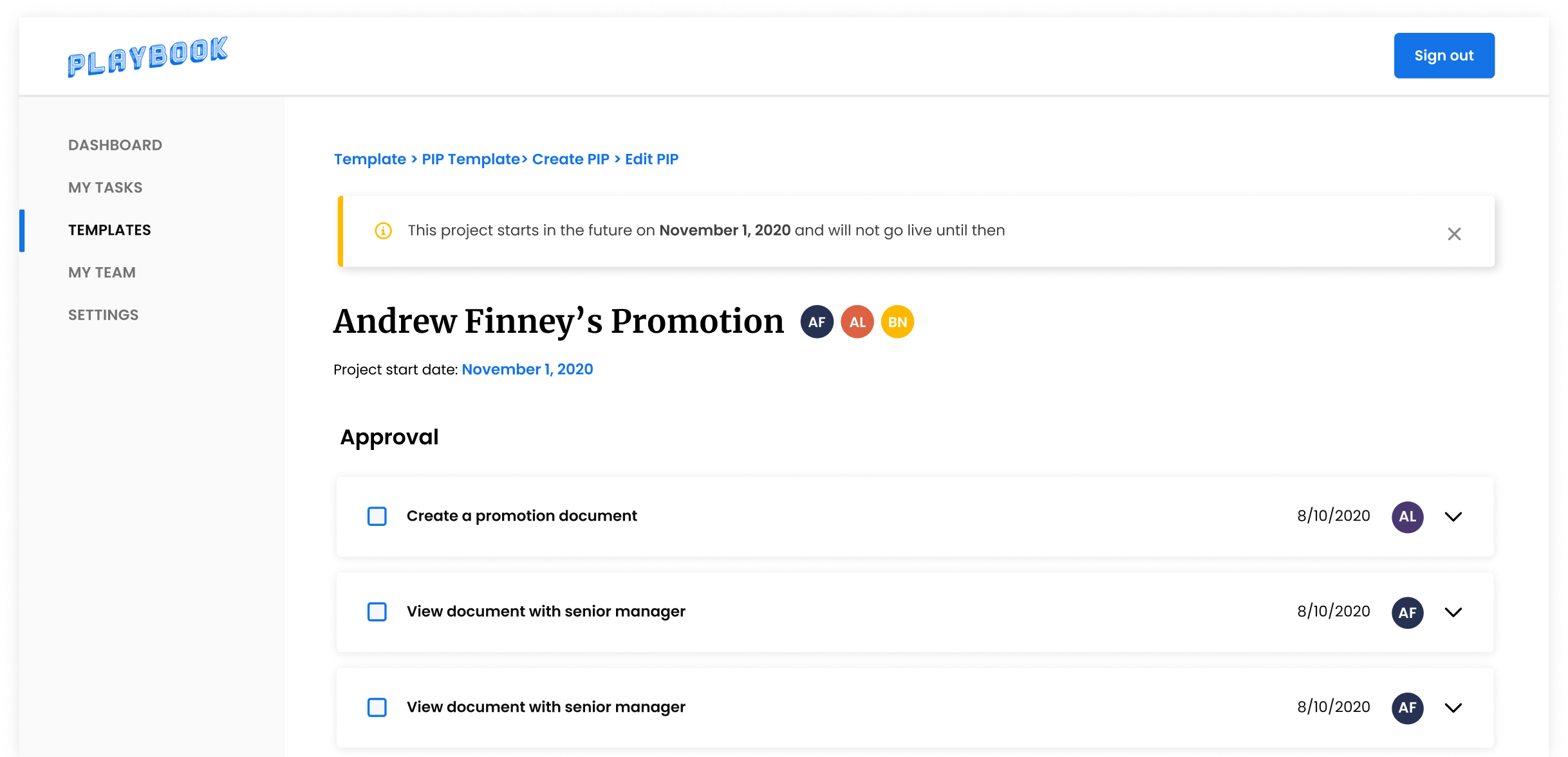
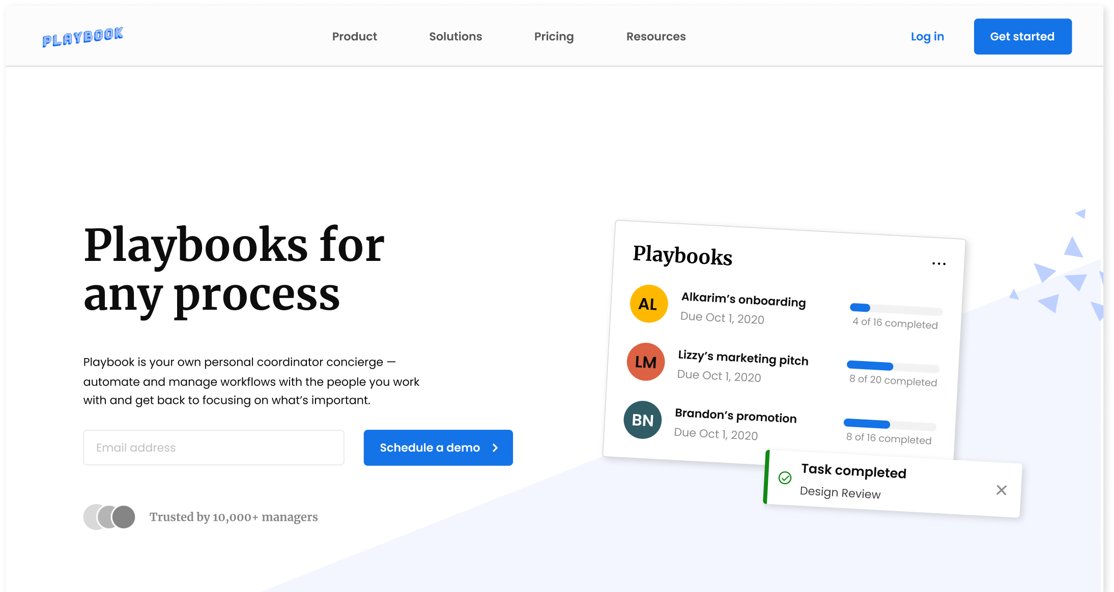
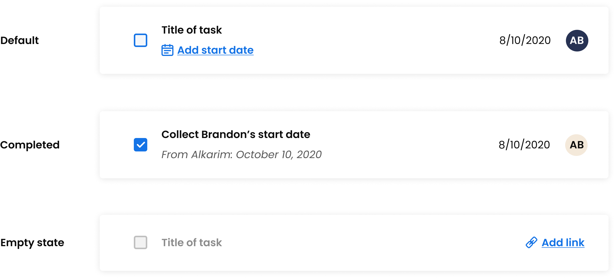
Defined a core design system spanning typography, color, layout, and component behavior 
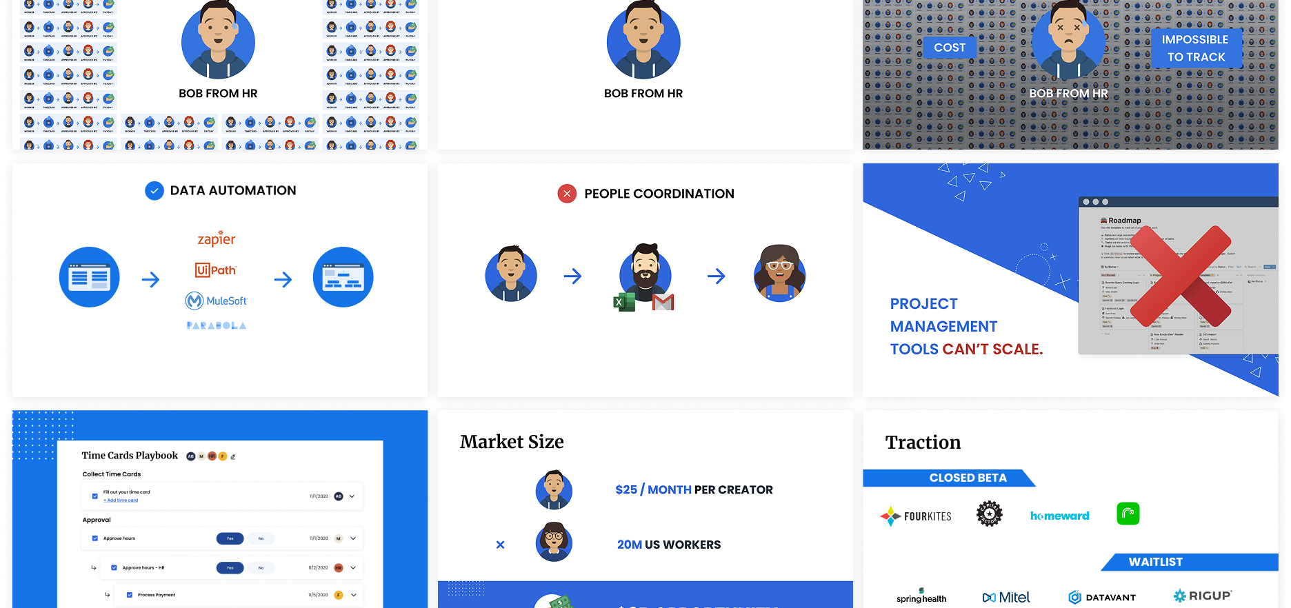
Applied system foundations across product UI, marketing surfaces, and investor-facing materials Established a scalable visual foundation the company continued to build on as it matured
Timeline
6 months, contract (Aug - Dec 2020)
ROLE
Associate product designer
COLLABORATORS
Alkarim Lalani
CEO, Product manager
Blaise Bradley
CTO, Product manager
OVERVIEW

Building early foundations for credibility

Playbook (now Rollout) was an early-stage startup focused on workflow automation, coming off a recent round of VC funding. The team needed visual assets that could clearly represent the company to shareholders, while also establishing a visual foundation that wouldn’t need rework as the company matured.

My focus was on defining the core design system early, and using early brand and marketing work to ensure those foundations could support a company with a rapidly evolving product still defining its voice and direction.

Playbook website

Weekly digest email

With the product and brand still evolving, the system needed to be flexible without becoming vague.

I focused on defining a small set of structural decisions — typography, color, and component behavior — that could support both marketing surfaces and product UI without fragmenting as new use cases emerged.

System foundations

Component behavior

Validating the system through real use

Once the foundations were in place, the system was used across both product and marketing to validate that it could support real content, real workflows, and evolving requirements.

Templates, dashboards, and pitch decks surfaced different constraints, but relied on the same underlying structure. Using the system in active workflows helped identify where flexibility was needed in the product — without compromising consistency or introducing one-off solutions.

MVP, Templates

Pitch deck

Setting the system up to scale

As Playbook was still early in shaping its identity, the system was designed to be intentionally constrained — favoring clear structure over exhaustive coverage.

By establishing a small, flexible set of foundations and validating them through real use, the team was able to grow the product and brand without revisiting core design decisions. This approach reduced rework, supported new surfaces as they emerged, and gave the company a visual system it could confidently build on.

System-level view of workflows

Setting the stage

Back in college, I found a huge problem within many first-generation students: they all felt detached from their culture due to language barriers and cultural assimilation.

Looking to my own life, I thought about my grandma and I, remembering how connected we are whenever we would make spring rolls together despite our language barrier. This common thread we shared through food is what sparked the idea for Reciculture, an open-source cookbook that consolidates recipes from students of all cultures and backgrounds.

"I have always been able to find a common thread between me and my relatives through food."

The problem

Minority groups do not feel as close to their own culture and family roots, and a lot of Americanized students want to discover tangible ways to get in touch with their culture again.

The mission

Create a global, accessible recipe hub where individuals can share their own cultural experiences through food & contribute to an overarching collection of cultures.

Jump to final designs ↑

Project scope

In the last decade, there has been an increasing global necessity to effectively tackle mental health problems. From Internet support groups to online cognitive-behavioral therapy (CBT), more and more struggling individuals are gravitating towards online systems as new outlets for expression.

Recent advances in AI applications have made accessibility to mental health treatment easier than ever, where individuals have better, consistent service accessibility, as well as a much-needed layer of privacy protection that eases users in unpacking feelings of fear, guilt, and/or shame. Essentially, mental health AI-based applications are the key to unlocking deeper introspection within users, as it parallels real psychologists and clinical therapy sessions.

Still, most of the market for AI-based mental health applications are saturated with rudimentary technology that provides surface-level feedback to users. The current technology — which uses fixed, patterned algorithms — fails to adopt adaptive and empathetic qualities that are paramount to the client-therapist relationship.

"How can we make expressive writing MORE frictionless & comfortable?"

Making AI journaling palatable with UCLA HCI

The UCLA HCI department seeks to break the barrier in current AI-based technology using natural language processing (NLP), a branch of artificial intelligence that reads, deciphers, understands, and makes sense of the human languages in valuable ways.

Throughout the course of the past six months, I worked on Journey, an interactive web journaling application that uses NLP to emulate cognitive-behavioral therapy sessions. The only AI-based journaling application to date, Journey bridges the technological gap in mental health intervention by creating an emotional support platform that aims to minimize all roadblocks to expressive writing and to reduce feelings of depression, anxiety, and stress within users.

Placing AI into perspective

I decided to look into the current market of the most popular AI-assisted mental health products to better understand how different companies utilize AI components to help maximize the self-reflection process.

All products emphasized the importance of personalization and positivity which greeted the user immediately. Youper and Woebot used automated computer-based feedback, and Quirk was more interactive and gave users greater freedom in determining how much intervention the AI provides.

Takeaways

Taken as a whole, the majority of AI applications have a very strict pattern of prompt-based chatbots to provide automated computer-based feedback.

Personalization is extremely limited.

Despite chatbots attempting to prompt for personal messages, the Q&A-style interaction with limited answer options forces the user with heavy AI intervention to find their pain points.

Cognitive-behavioral therapy isn’t so cognitive.

With the exception of Quirk — which provides insight into cognitive distortions — the rest of the programs are not constructive and fail to provide users a framework towards healthier mindsets.

It’s important to share how you really feel.

The universal feature that is found in all of these applications is how the AI attempts to discover the deeper rooted feelings within the user, where the end goal is to ensure that the user feels validated with their emotions.

Cognitive science & NLP

Additionally, I did a lot of research into how specific cognitive psychological theories are able to provide constructive feedback in understanding the user. With every cognitive psychology theory, I found an existing NLP component in some other applications to brainstorm ideas for APIs developers on our team could use in Journey.

Watson NLU Text Analysis by IBM

THEORY

Cognitive distortions, for example, serve as a way to help users dispel the irrational thought process behind their false beliefs, which strengthens negative thinking and causes chronic mental illnesses like depression and anxiety.

EXISTING APPLICATION

IBM’s Watson NLU API analyzes cognitive distortions by compartmentalizing specific target phrases and keywords into emotions and sentiments (e.g. extremely negative phrases are flagged as all-or-nothing thinking, a type of cognitive distortion).

Smart Compose by Google

THEORY

Self-disclosing personal and intimate information to others has demonstrated emotional, relational, and psychological benefits (if done in a safe and secure environment) as it emulates a sense of understanding.

EXISTING APPLICATION

Smart Compose helps generate real-time suggestions that not only reduces repetitive typing, but also predicts information using a neural language model to understand what the user will say next.

Interacting with Journey

We sought to determine how NLP components would be implemented in designing the user interface. I developed a chart to showcase a feature hierarchy to see how often the AI would interact with the user throughout the journaling process.

Four features tie in aspects of various NLP components: Reminders, Guiding Dialogues, Auto-Suggest, and Connection & Friendship. These features establish a framework to shift the user’s thought process to an environment similar to clinical therapy sessions.

Validation check

Being the lead designer on this project, I wanted to integrate NLP in a meaningful way into the UI. I decided to walk through the logistics together with my project lead, Violynne, so we could validate each other on the various pain points for the four features we came up with before I got to designing.

Design decisions

The most fundamental part of designing for mental health applications is to reduce the cognitive load as much as possible for the user. This promotes expressive writing and ensures that users develop a personal relationship with the application.

Because of Journey's simple nature and past fieldwork research on features, I decided to skip low-fidelity prototyping and jump to mid-fidelity so our team’s developers would have a more effective framework to work on.

Reducing cognitive load

In this first version, I wanted to emulate skeuomorphic design with red lines (similar to a piece of lined paper) and stick to a minimalist style guide to reduce the cognitive load as much as possible. With minimalist iconography, one font family, and a couple of colors for cognitive distortions and types of days, these elements helped draw attention to the writing process more than anything else.

Meeting with the professionals

Our team consistently met with various professors and counselors to validate our prototypes, which sought to improve the information architecture by adding necessary features while removing useless ones. I had the privilege to meet with Dr. Greg Miller, a clinical psychologist at UCLA who specializes in CBT, who gave me questions into specific problem areas he found within Journey’s initial prototypes:

Do I really have to see my problems as I write?

Individuals do not have to be shown consistent problems within their writing. Rather, the AI should consider how to make judgments about when to give a lecture on cognitive distortions and when to respond similarly to what a therapist would do.

What if I’m colorblind?

Because the identification of the five main cognitive distortions is color-coded, this may cause users to visualize the same grey for different distortions. Implementing a colorblind palette would be optimal for all users.

Is this the best way to evaluate interventions?

The current version of the prototype underlines every sentence with color to showcase a unique cognitive distortion, where it then presents a similar example in the box. Although this is necessary, adding more features in the box below could make Journey a powerful tool in CBT.

Iterate, iterate, iterate

Taking into account Greg’s feedback, I decided to undergo rapid prototyping to make sure that I addressed all of the pain points.

Reflective mode

With rapid prototyping, I was able to come up with reflective mode, which essentially was the holy grail in solving all of the questions Greg had. In reflective mode, individuals can see everything — the unique cognitive distortions, auto-suggest replacements, guiding dialogs, and other features that may be implemented in Journey later on.

This reduced the cognitive load on the user during the expressive writing mode, as it was similar to regular journaling (only with minimal intervention with guiding dialogs). Additionally, this mode was able to make better use of functionality, using the visual stimuli as a call-to-action to reflect on writing.

Mr. Sun (the AI avatar similar to Mr. Clippy from Microsoft’s Office Assistant) would prompt the user after a while of being idle to reflect.

COLOR PALETTES

Following WCAG 2.0 standards for color contrast accessibility, I developed a universal colorblind palette and a dark palette to account for a larger demographic of users. In all modes, I scrapped the initial color palette and stuck to three uniform colors that associated all distortions with the type of day the user is having — all to further reduce cognitive load.

Dark mode sought to address nighttime use for night owls. Similar to f.lux, this would work by automatically changing color based on the timezone the individual was in, and if users wanted to change the mode indefinitely, they can use the toggle to switch from day to night.

Putting it all together

I reduced the initial design a lot by omitting the cognitive distortions until the visual stimuli (Mr. Sun) prompts the user. Remembering the goal of designing this product, I aimed towards creating a frictionless experience in expressive writing, allowing individuals to write without obstruction.

Three modes.
You pick.

In accounting for a larger demographic of nighttime users and colorblind individuals, the three modes (light mode, dark mode, colorblind mode) were created so people can focus on writing. Underlines were changed to highlights, but the original visual identity remained intact across all three modes.

Time to reflect!
Or maybe later.

Similar to Google's Smart Compose, the Journey AI would emulate “thinking”  through ellipses. Additionally, being idle for too long would prompt the user to reflect on their feelings by clicking on Mr. Sun. After a short amount of time, the prompting message would disappear but reappears at the next idle moment to remind the user to reflect later.

A more positive way with words.

It was really important to our team that we got the algorithm for auto-suggesting right. Upon being in reflective mode, users can click into negative phrases and replace them with more positive ones — we wanted to leave it up to the user to make these changes themselves, like a typical successful therapy session would.

Next steps

Journey has been a journey. As mental health is not linear, our team is constantly trying to break into various ways we can improve features for AI intervention and evaluation.

As the lead UX designer on this project for the past 9 months, I anticipate on doing more usability testing with a larger demographic to discover new features that would make expressive writing easier.

ACKNOWLEDGEMENTS

I am extremely grateful for the opportunities that Violynne Wang, my director, and Professor Xiang Chen have given me on this project. As we wrap this project up later this summer, I hope to improve user experiences for more AI-based projects with the UCLA HCI department, but stay tuned for more updates with Journey.

You can view my full-fledged research paper on Journey here.